Family Education
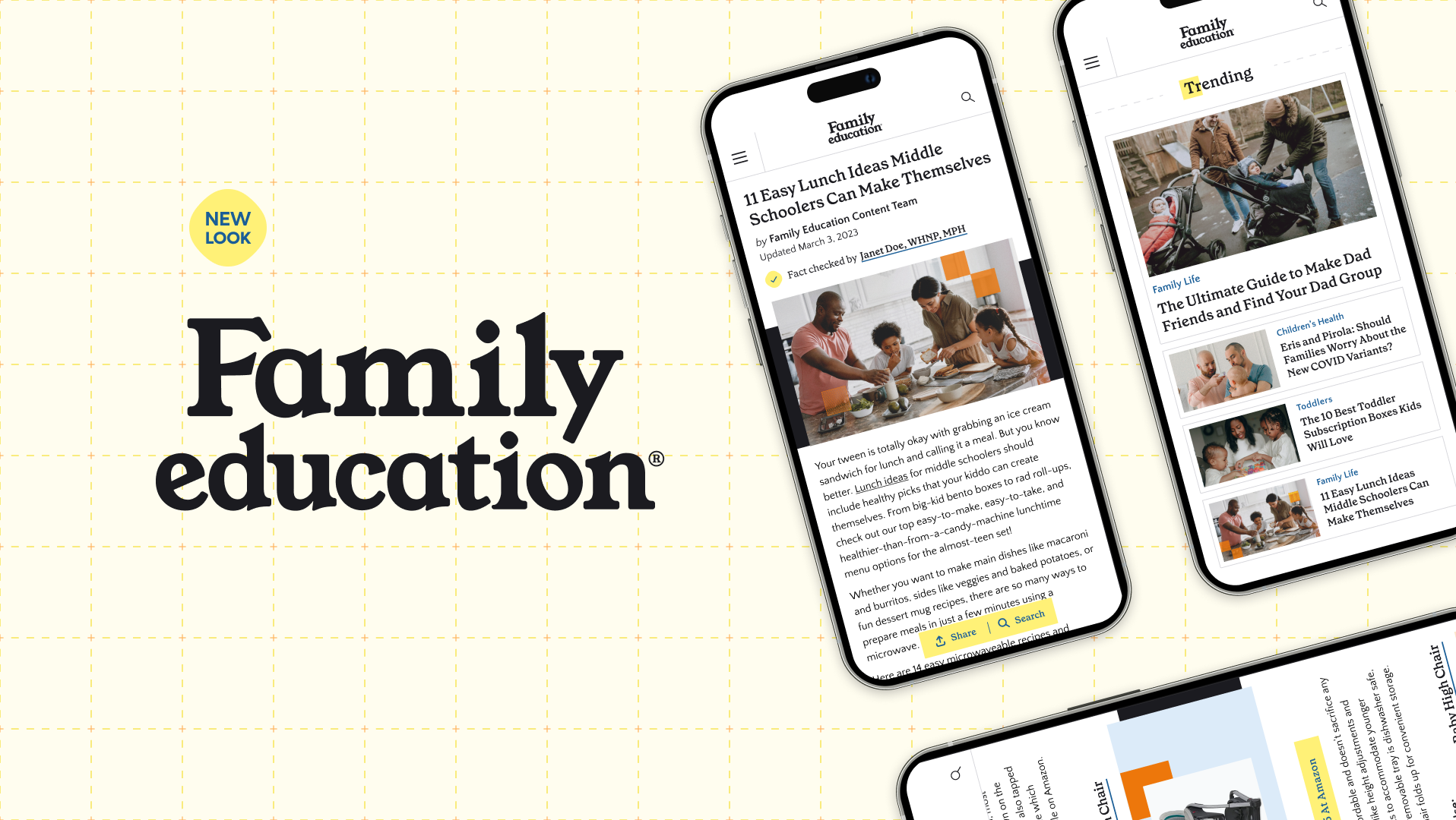
Family Education is a trusted source of advice for parents at every stage of their children's lives that I was able to work with through our internal marketing group. Before the team asked me to refresh their brand identity, I worked to improve the user experience of their popular baby name pages.
Overview
Baby name hunting is one of Family Education's top offerings, and individual name pages are sometimes the first stop in a user's journey. So we set out to create the experience as a one-stop resource for baby names— improving the ease of use, SEO optimization, and bringing the design up to date on the latest article page design (completed by a different agency).
Factors that users weigh heavily when selecting a name include the name's popularity and how common or rare it is. They also care things like what nicknames go with it, or even how to pronounce it, which was all found in the long form content. So we highlighted the key features of a name upfront, introducing name pronunciation with audio, and gender, rarity, and trending tags that serve as anchor links. To handle navigating to other aspects, we increased the visibility and usability of the table of contents.
For ease of use, we introduced a segmented share + baby name search button. Browsing names by letter was a popular feature on the main baby names hub, so we incorporated that directly into the search on all name pages. User data informed the order of the share options, Pinterest being the most popular.
The Impact
Refreshing the baby names lead to an increase in the overall traffic and usage of these pages, and greater design cohesion.
The Future
These designs were completed using Family Education's original branding and colors, which has some accessibility issues. ADA compliance was ensured during the rebrand:
Suit Up Games
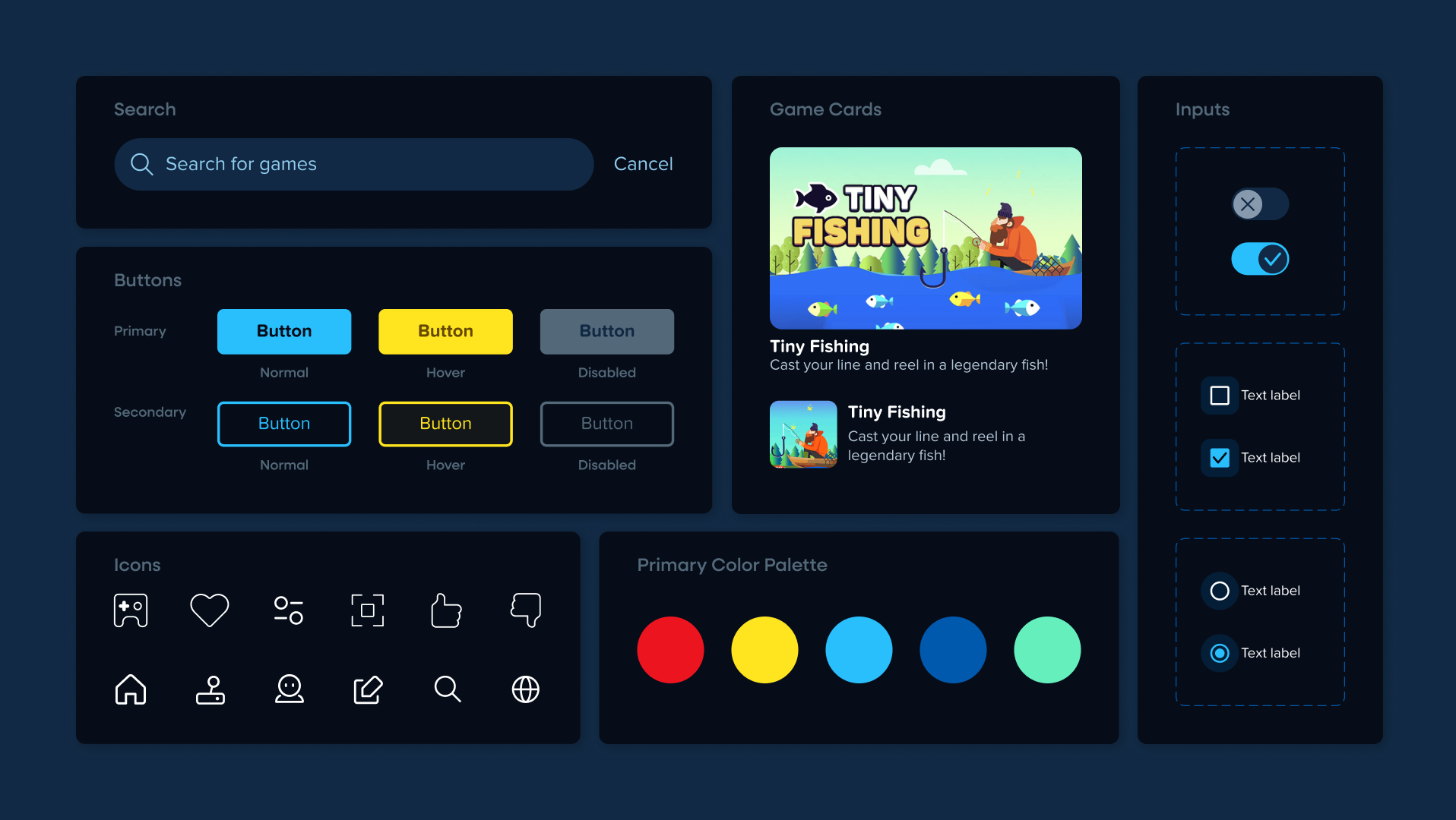
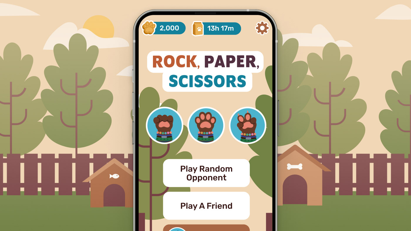
Suit Up Games is a part of the Sandbox Group gaming vertical, developing unique Roblox experiences for brands. Refreshing their website and pitch deck meant expanding their visual language, and establishing rules for typography and iconography. The website consisted of 3 page designs: homepage, blog ("Trends"), and individual blog pages, and lead to an increase in successful brand deals.
TeacherVision
To introduce more users to the download flow, TeacherVision needed a new page template for their report card comments that emphasized the download button and communicated its value to users. While the download is free, I used e-commerce UI patterns to refresh the design so it's more of a digital product page than an article. The new layout places the download button higher, pushes the article lower, and informs users of exactly what they're downloading.


