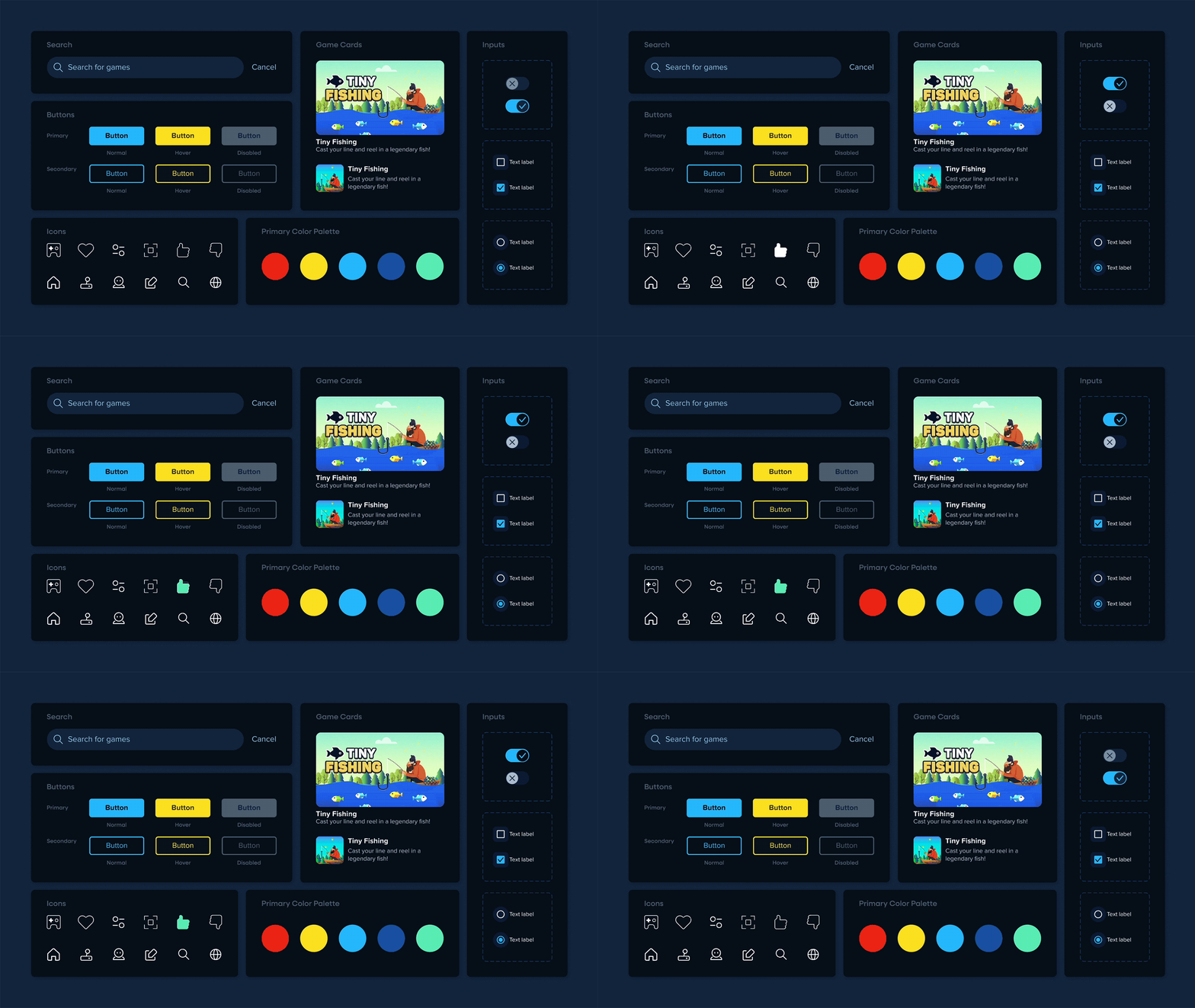
Coolmath Games is a beloved browser gaming platform enjoyed by millions of players. As the lead designer on the product, I reported to the Director of Technology and Analytics, and collaborated closely with him, the Head of Product, our development team, and eventually another UX designer to redesign nearly the whole website. Through continuous research and planning, we were able to introduce designs and features that increased usability, user engagement, conversions, and SEO optimization, with an emphasis on content discovery and personalization.
Highlights:
+75% Pageviews
+37% User engagement
Content Discovery
Recommended Sections
+12% Conversion rate of recommended content
Game and category pages are core to the site's experience and commonly the first stop in users' journeys, so we sought to improve game discoverability with curated and personalized recommendations. Users ranked popularity high as a factor they consider while picking games to play. So we increased our conversion rate by replacing static lists with dynamic ones, including the improved 'You'll Also Like' section and the new 'Continue Playing' and 'Popular in Your Area' sections on game pages. We carried this idea over to category pages, sorting recommended games by default and adding a list of our most popular categories.
In addition to major functionality improvements, Coolmath’s search was upgraded with its own recommended sections. When entering the search experience, users are shown trending searches and games by default. If they search for a game unavailable on the site, the results page also presents them with tailored suggestions to reduce bounce rates and help them find a similar game they'd enjoy.
Further feedback and testing has shown that we should continue to iterate on the recommended sections for our end users. We've already rolled out changes to 'You'll Also Like' that performed better through testing, and we plan to try suggesting content based on playing history throughout the site.
Game Cards
-11% Bounce Rate
Through surveys and other feedback channels, users shared that they didn't find the game images Coolmath Games once donned engaging enough, and that they value descriptions while deciding what to play. Game cards previously used small, unclear images that were screenshots of gameplay. We conducted A/B testing to find that large images featuring game titles/logos like key art and video previews had a significant impact on clicks, bounce rates, and session duration.
Our game cards now include images that are large and hover to a video of gameplay. We made sure to keep descriptions in our new design, and introduced mini descriptions as exciting CTAs for special game promo cards. With over 2,000 games and a tiny design team, including titles within game images is an ongoing effort and the most popular games have been updated first.
Information Architecture
Expanding Navigation & Search
Refining our information architecture played an important role in our content discovery gains, and of the whole site, Coolmath Game's navigation and search had the largest room for UX improvements. We found that while categories are one of the primary ways users discover and select games to play, it took too many clicks and was even impossible to get to some category pages without using a separate search engine (or just knowing the url).
We greatly increased the discoverability of these pages by adding subcategory dropdowns to top level categories already in the nav, creating an 'All Categories' page with its own popular categories dropdown, and expanding search to include categories too. The new search experience also increased visibility of game pages. We added the ability to search games by description in addition to title (previously the only functionality), a dropdown menu that suggests games by default, and result pages (SERPs) that allowed us to include the 'You'll also love' section discussed above.
Our navigation is a bit crammed on our users' most common resolution, but several tests have shown that it's difficult to nest legacy links in dropdowns without hurting key metrics. Fortunately, we were able to create space by removing a redundant "more" dropdown, merging 'Playlists' into our 'All Categories' page, nesting daily games in the popular categories dropdown, and simplifying the random button to use an icon instead of text.
I found that the top & subcategory naming and grouping is confusing for not only users, but also the team internally. Playlists were once treated completely separate from categories, although they are structurally the same, unifying a set of games. Even Trivia is similar to a top level category, though it collects quizzes rather than games. Further research is still needed to inform rolling out new names and structures of these collections mindfully, though they are unified by design.
Filtering & Sorting
We also introduced a feature from our users' wishlist on category pages: filtering & sorting. It allows them to refine game lists by genre or device, and sort by popularity, release, and title (A-Z and Z-A) in addition to the default, recommended. This covers the top ways our users said they like to browse games and will be rolled out to SERPs and other pages following the category pages.
The Impact
Improvements to the information architecture and content discovery of Coolmath Games saw significant outcomes like higher user engagement, longer sessions, positive user feedback, and revenue gains for the business. The projects I completed during my time with the team have transformed the product, and informed the company's design practices, allowing for more robust and frequent testing than before.
Coolmath Games is a longtime popular gaming site, and it has even happier users now.
+75% Pageviews
+37% User engagement
+13% Session duration
The Future
The navigation, categories, and recommended sections continue to be tested and updated, and there are plans to further improve search to promote content discovery— among these are offering suggestions when the user makes a typo, and ignoring punctuation (for popular searches like 'Papa's games').
The great outcome of these projects have indicated wins we can get by carrying similar ideas over to the homepage and "All Games" page, like personalized sections/feeds, filtering and sorting, and bringing engaging Trivia quizzes into the spotlight like we did for categories. My last project with the team was overhauling Coolmath Games' homepage using these insights and our new typographic and color direction. See the new look in the brand guidelines case study, or check out the design system that made this all happen.


