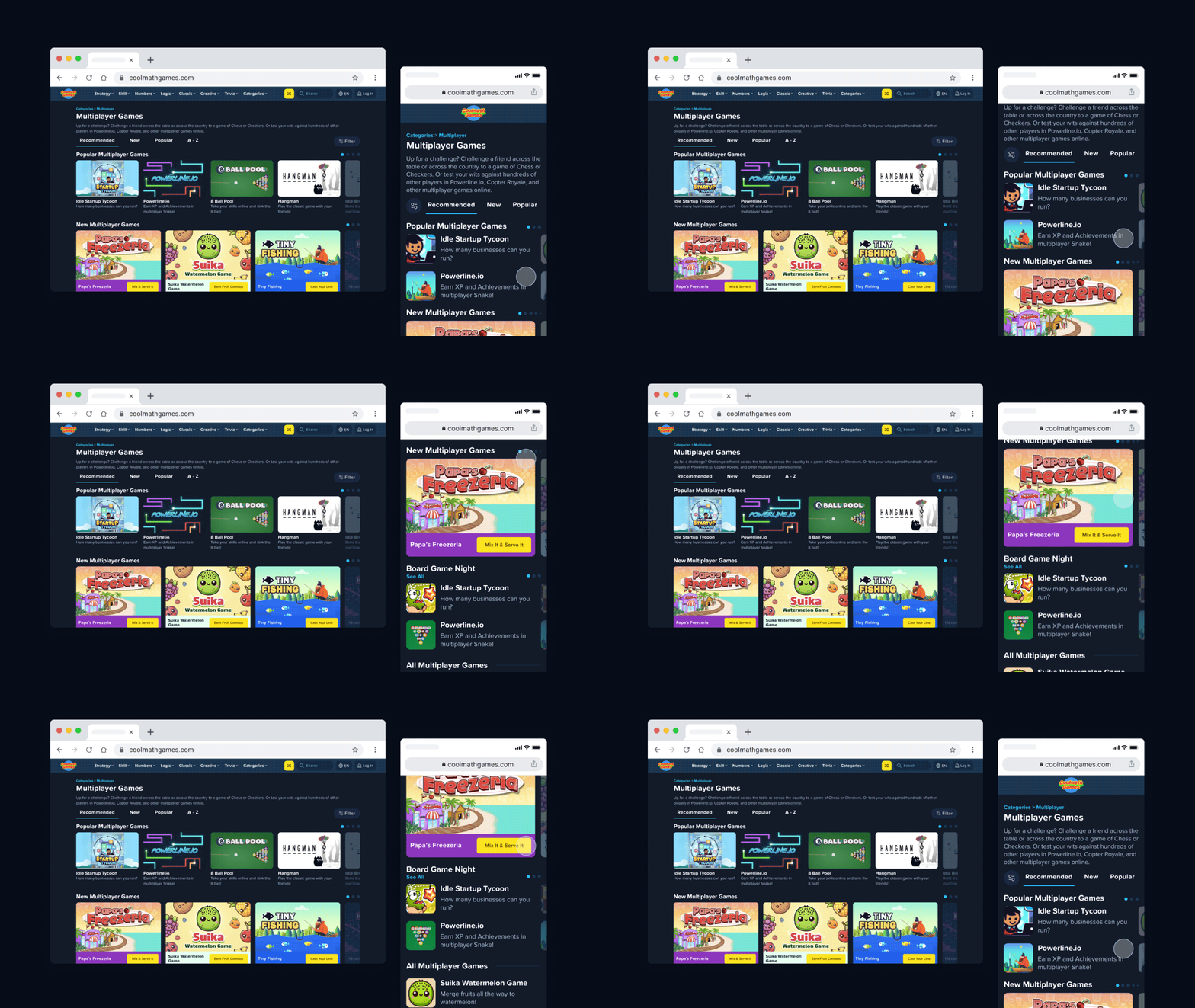
Coolmath Games elicits tons of nostalgia and excitement, but this memorable brand didn't have a defined visual identity or design team when I joined as the first in-house designer. While I never had the chance to do a full-fledged brand refresh, I strengthened the brand's visual identity and processes with the creation of design docs, assets, brand guidelines, and a one-of-a-kind design system in Figma that made rolling out updates a breeze.
The design system was updated with new typography and color rules in September 2024, which aren't reflected below. You can see the most current look in the brand guidelines case study.
The Foundation (Before)
I put together this sheet to outline Coolmath Game's identity as it stood during my first month. It was a challenge to work with so little in the beginning. But overtime, I was able to refine and expand Coolmath's design language, referring to the brand's iconic qualities and past to define its future.
There's still heaps of space for the brand to evolve, so the work you see here is just the new foundation for tomorrow.
Color
The palette is still vibrant but much more versatile than before, and with defined WCAG safe color pairs and uses. For example, seafoam and orange are used to indicate success/failure and positive/negative states.
Components
I created the component library using atomic design & object oriented UX principles, with scalability, reusability, and accessibility in mind. For example, I ensured that keyboard users could navigate our nav dropdown menus with ease following WCAG recommendations.
This component system significantly sped up the design process, allowing us to rapidly iterate and prototype new features.
Iconography
Category Icons
I created over 150 colorful category icons that are used throughout the site and within promotional graphics. These icons follow nearly the same rules as UI icons, but with their own stylistic choices for applying color and creating an illusion of depth. All of the icons were imported into Figma and set up with color tokens to future-proof brand color updates.
Illustrations
I also created an illustration library of popular characters on Coolmath Games in Figma for easy cross-team collaboration.


