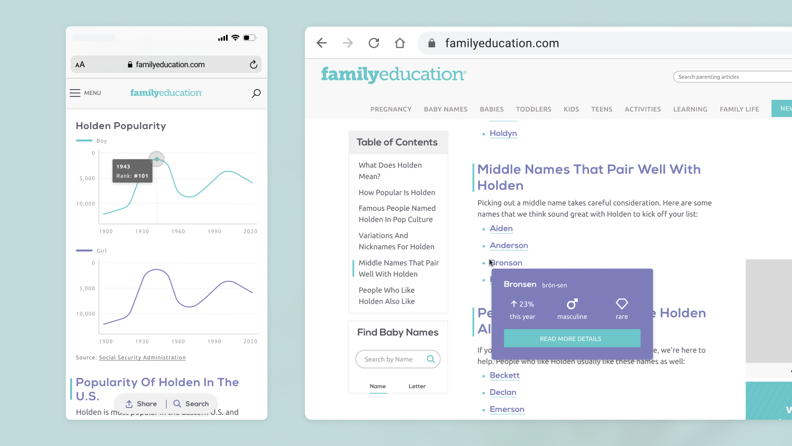
Family Education needed a fresh brand identity to support their new direction as a parenting resource for every year of a family's journey, not just from 0-3 yrs. The team preferred a stark departure from their previous branding, in favor of one with more sophistication and gender neutrality. This was informed by research and user personas.
I let the phrases "approachable," "community pillar," and the idea of passing on memories guide the way. The new look positions Family Education as the honorary "unty" of the parenting community, ready to dole out wisdom whenever someone needs it.
Prior to this brand refresh, I worked with the team on overhauling the UX of their baby name pages. You can read the case study here.
Logo
Color
Family Education’s color palette is lively, gender neutral, and welcoming. It fixes the accessibility compliance issue of their previous palette, and still suits Family Education's popular baby content with pastel shades.
Photography
Family Education's new identity gives the impression of personal photos with the qualities of point & shoot photography. Below is an excerpt from the brand book:
Buttons and Links
Brand Application
The full package for Family Education contained logo & pattern files, a basic Figma design system, and a 23-page brand style book including photography guides, WCAG safe color pairs, and brand applications.


